10 Visualising Point Data in QGIS
If you would like to follow along, you can download the data file used in this section by right-clicking the link below and choosing ‘save link as’ to save the csv file to your computer.
–>Right-click here<–
11 Importing point data from a .csv file
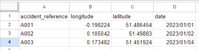
Our data is stored in what’s called a ‘.csv’ file
A csv has columns of data separated by commas, like this:
accident_index,longitude,latitude,date
A001,-0.198224,51.486454,2023/01/01
A002,0.105042,1.49883,2023/01/02
A002,0.173482,51.451924,2023/01/04
When we load it into a program like Excel, it turns it into a table we can read
So we can say that our file is a text file that is split - or ‘delimited’ - by commas
So we need to tell QGIS that!
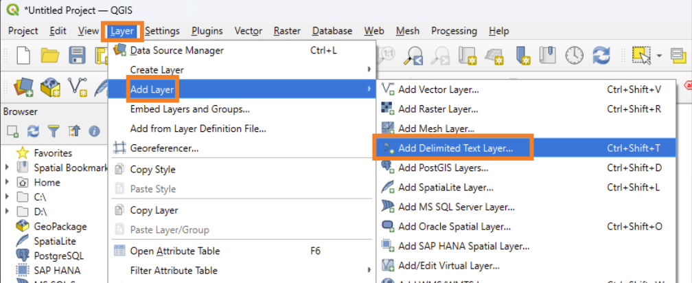
Select ‘Layer’ → ‘Add Layer’ → ‘Add Delimited Text Layer…’
Click on the three dots to open up the file browser
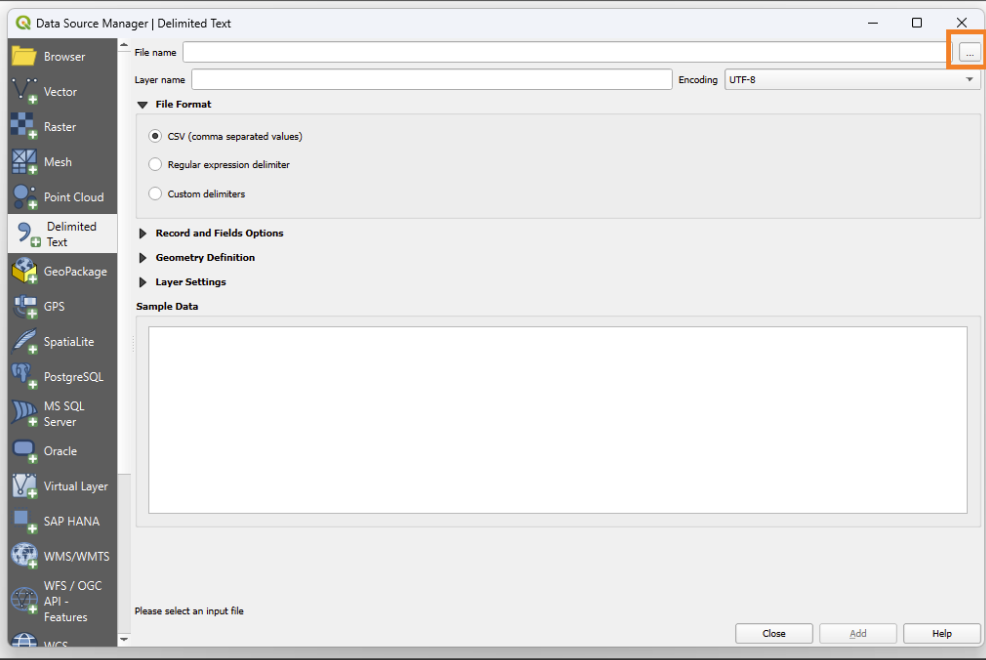
Navigate to where your file is located.
It will automatically show only files that are delimited text. When you reach the file, either
Double click on the file OR single click on it, then click ‘Open’
11.1 Setting the CRS of our data
Now we need to tell it what columns to use to determine the location of each point
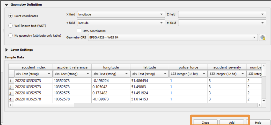
Click on ‘Geometry Definition’
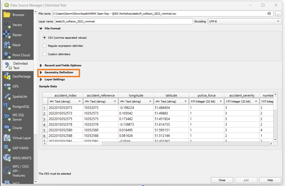
First, check that it has correctly picked up the ‘latitude’ and ‘longitude’ columns from the dataset
If our columns are named this in our input file, it should do this automatically.
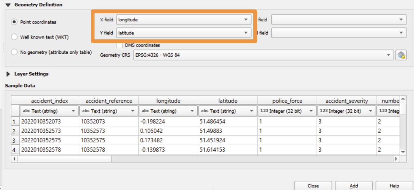
Now we need to select the correct geometry CRS.
But how do we know what is correct?
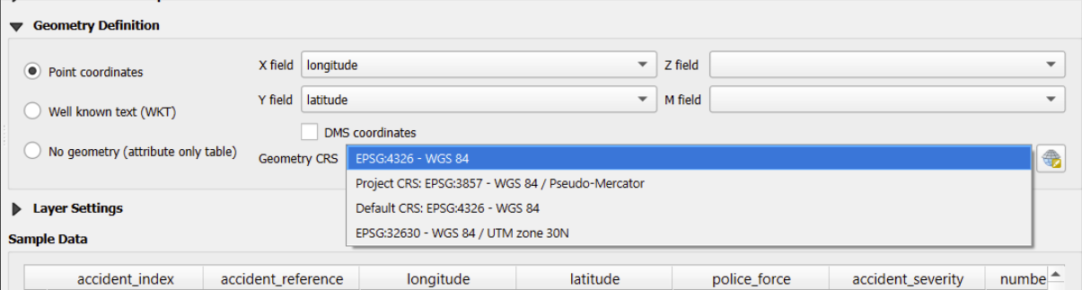
What matters here is the CRS used in the data originally.
If it is different to the project CRS - which is explained below - then QGIS will reproject the data you import so it matches up with the project CRS.
If you are unsure what CRS has been used for your data, there are a few you can try, starting at the top of this list: - EPSG:4326 - WGS 84 - EPSG:3857 - WGS 84/Pseudo-Mercator - EPSG:32630 - WGS 84 / UTN zone 30N
It will usually be very obvious if it’s wrong, because your data will be in totally the wrong place!
If it’s wrong, then delete the layer by right clicking on it in the layers tab
This seems like a bit of a boring topic - but I promise you it will save you some headaches down the line!
It doesn’t matter if you don’t fully understand all of this section right now - but if you import some data that keeps ending up in the wrong place, just think to yourself ’could this be because of the coordinate reference system? - and then come back and read this section again!
However we start our project - whether that’s by using the OpenStreetMap basemap or doing something else - then there are a few things to note about the coordinate reference system of our QGIS project.
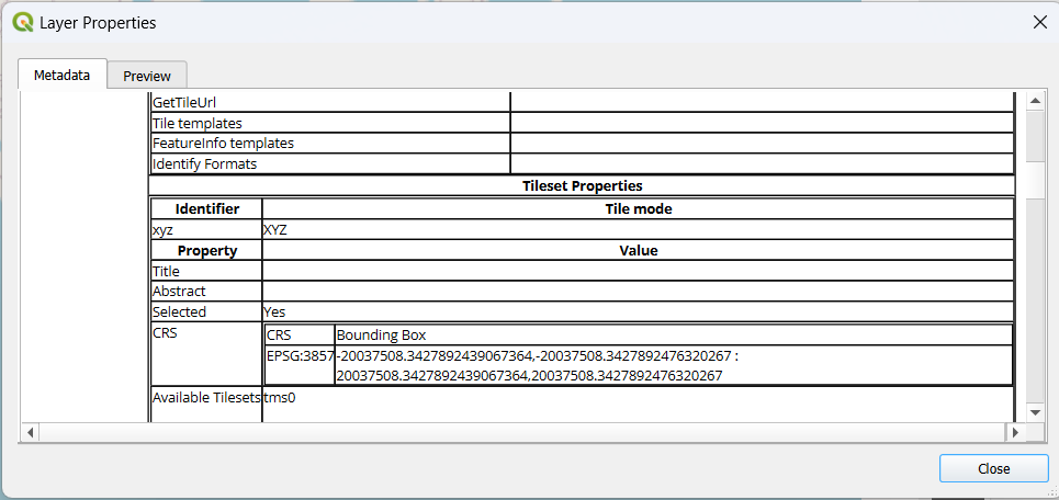
We can always look at the bottom-right corner of QGIS to see the coordinate reference system being used by our project.
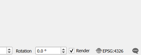
If we click on that, it will bring up the project properties and open the ‘CRS’ part of the properties dialog automatically, which will look something like this.
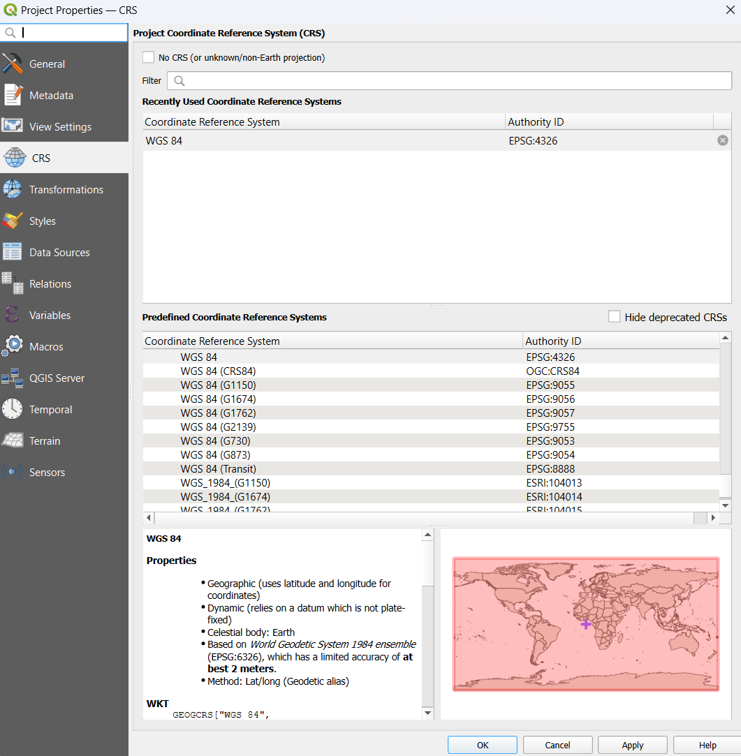
Now, here I’ve already imported the OpenStreetMap basemap as shown in the step above.
Note that here what is selected is called EPSG:3857 - also known as WGS:84 / Pseudo-Mercator.
If we right click on ‘OpenStreetMap’ in the XYZ tiles and scroll down a bit, we can see that this is the CRS of the OpenStreetMap ‘tileset’ too.
It’s important to know what CRS your project is using as when you come to import data from other files, it may not be using the same reference system and the data will have to be transformed to ensure that the points or areas end up in the right place at the end!
But there’s a twist…
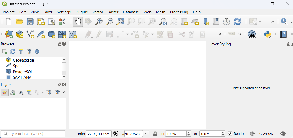
If I now create a new project and look at the CRS, we can see it’s different!
And this is due to one of the default settings in QGIS.
If I go to “Settings” –> “Options” –> “CRS and Transforms” –> “CRS Handling”, then you will spot some things about how QGIS deals with CRS options by default.
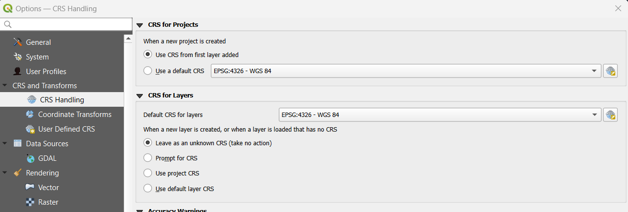
What we can see is that the project CRS will be based on the CRS of the first layer added.
So if we load in the OpenStreetMap basemap first when we create a new project, our projection will be EPSG:3857 - also known as WGS:84 / Pseudo-Mercator.
If we load in some other data first - which you might decide to do once you’ve got a few projects under your belt, or you might do if you get started and only realise afterwards that you haven’t loaded your basemap in yet - then you might find that your project is not using the CRS you were expecting!
Now - this isn’t a problem by itself - but it can cause confusion about what CRS you should use when you try and load in additional data!
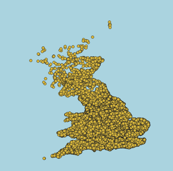
For example, here I’ve loaded in a dataset relating to the United Kingdom. There should be some points on the UK… but where are they?
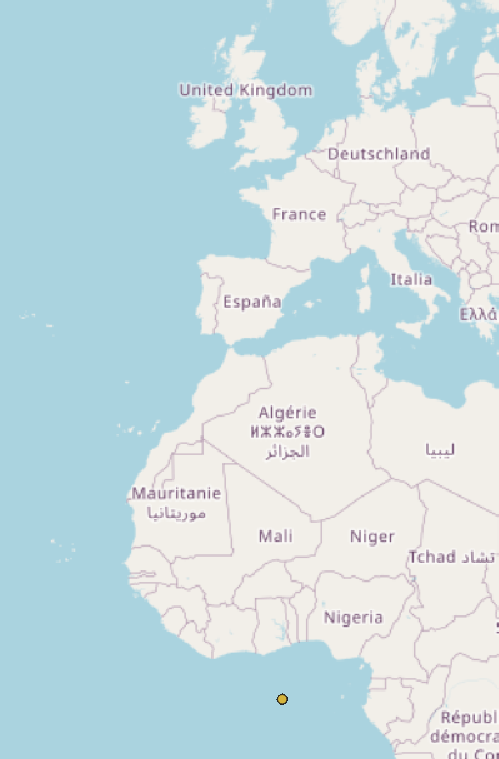
Well, the only point I can see is in the sea off the coast of Africa!
If I zoom a really long way in, it turns out my points did load in - but they’re not anywhere near the UK on my basemap.
So what went wrong here?
When I loaded this data in, I told QGIS to use the project CRS.
But that’s not what QGIS is expecting!
It wants me to tell it what the CRS is of the data I am loading in - it already knows what the project CRS is! It just needs to know what it’s loading in so it can work out how to translate between the two.
Once you’ve chosen the correct CRS, click ‘add’, then click ‘close’.
Once you’ve done this, your map should look something like this:
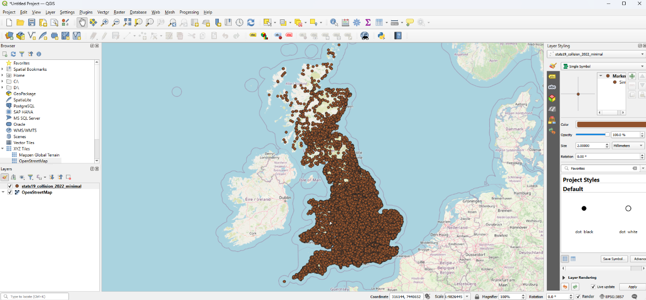
Now we’ve got a map, let’s take a few minutes to explore some of the patterns we can see.
Try zooming in and moving around.
Maybe explore an area you know, or look at the layout of roads in some of the areas with more or fewer accidents than others.
11.2 Styling points
Now we have the accidents, but there’s so many that it’s hard to tell much.
Let’s try splitting them out by severity.
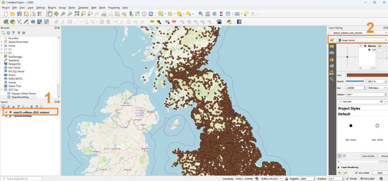
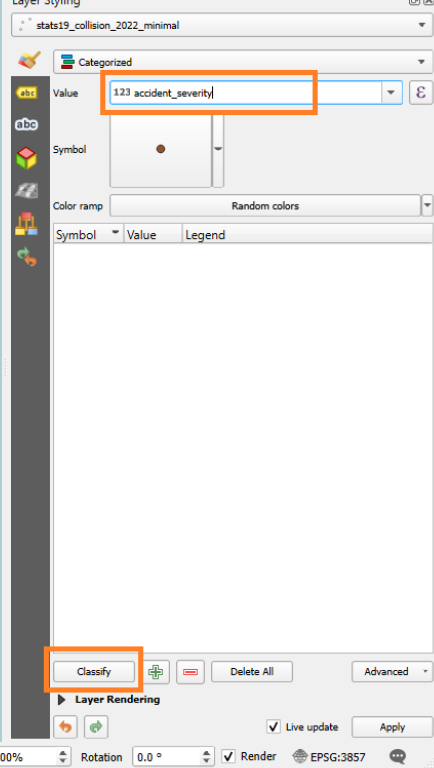
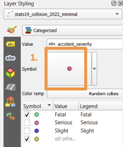
Select your imported layer of points - if you’re following along with the dataset, this will be called stats19_collision_2022_minimal layer - in the layer panel by clicking it.
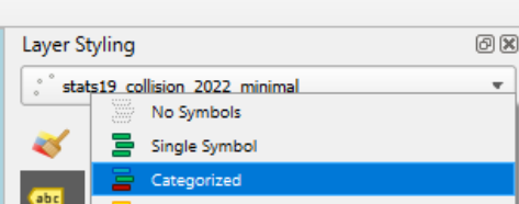
Click on ‘Single Symbol’ in the layer styling panel.
In the dropdown menu that appears, select ‘Categorized’
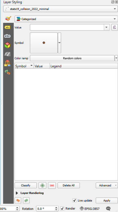
Your layer styling panel should now look something like the image on the right
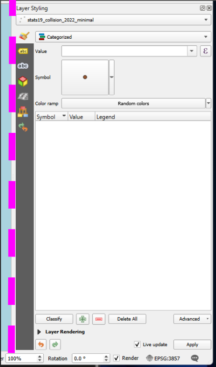
Your layer styling panel might be too narrow by default, which cuts off some rather important buttons!
Hover over the left edge of the layer styling panel until your cursor changes to this icon: <–>
Then drag it to the left until it takes up about a quarter to a third of the page and shows all the buttons below.
Now we want to tell it to categorize by one of the columns in our data.
Select ‘accident_severity’ from the list.
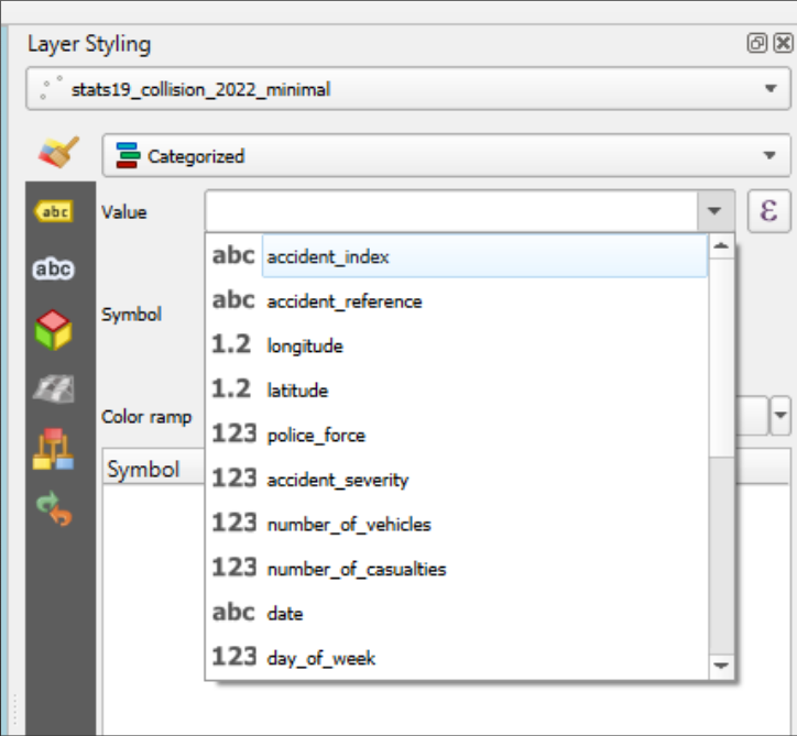
Then click ‘Classify’.
Once clicked, our points will have different colours (maybe not these exact ones).
You can see the categories it has created in our layer styling panel.
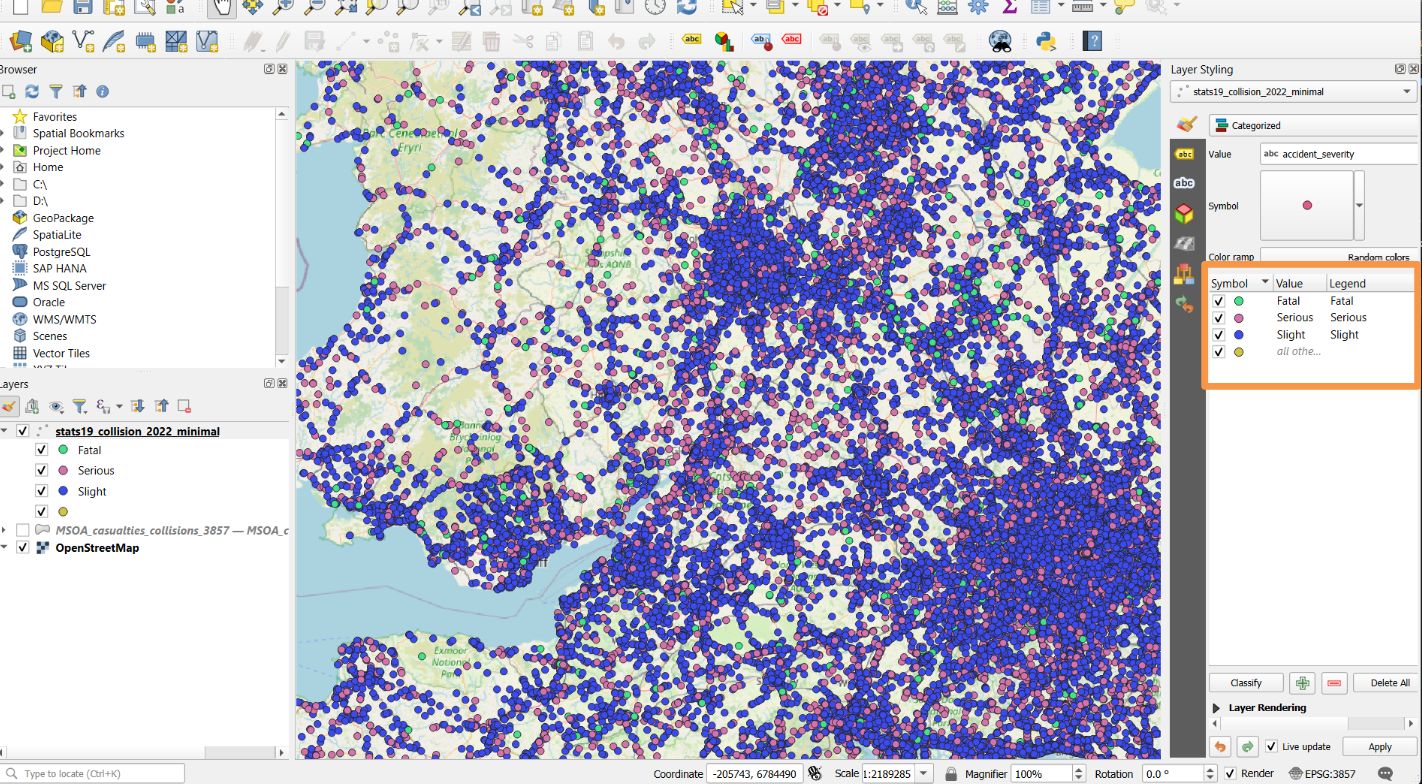
11.2.1 Hiding points
We can hide some of these points by clicking the checkboxes (ticks) to the left of the symbol colour in the Layer Styling panel.

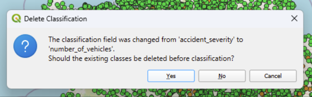
Try changing the selected value and click ‘classify’ again. Explore some of the different things we have in the dataset.
Which work well as things to colour our points by?
Experiment with hiding certain values by unticking them in the layer styling panel.
Hint: you will need to click ‘yes’ when it asks you if existing classes should be deleted before classification, otherwise you will end up with categories in your legend that aren’t being used.
11.2.2 Colour and size
With the layer selected, look at the layer styling panel.
Click on one of the categorised symbols in the section with the headers ‘symbol’, ‘value’ and ‘legend’, then click on the symbol itself (marked 1. in the image below) to load a new page with options for point colour, opacity and size.
Next, you can change the colour, size or opacity using the options highlighted in the box marked ‘2.’
You can then click the arrow marked ‘3.’ to return to the previous page.
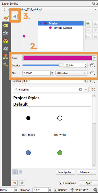
Your changes will automatically apply if the small box labelled ‘Live update’, which is next to the ‘Apply’ button at the very bottom of the layer styling panel, has a tick in it.
Exercise 3
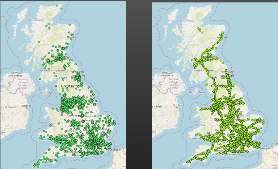
Try changing the size, colour and opacity of some points to make the important information stand out more for a chosen category of information.
You can also choose to hide some categories.
Think about the story you want to try to tell with your map. What important things do you want someone who looks at your map to take away from it? How can you use size, colour and opacity to support this?
Here, for a map where the accidents have been classified by severity, we have - Reduced opacity of less severe accidents (so full accident patterns can still be seen - we can still spot areas with more accidents overall - while making them less obvious) - Increased size of fatal accidents (so they stand out to the viewer) - Changed severe accidents to a colour more traditionally associated with ‘bad’

:::
11.2.3 Custom Markers
11.3 Adding labels to points
In addition to changing the markers, we can add labels to our points.
Now, simple labels can be a little hard to read, especially if we have a
11.4 Next Steps
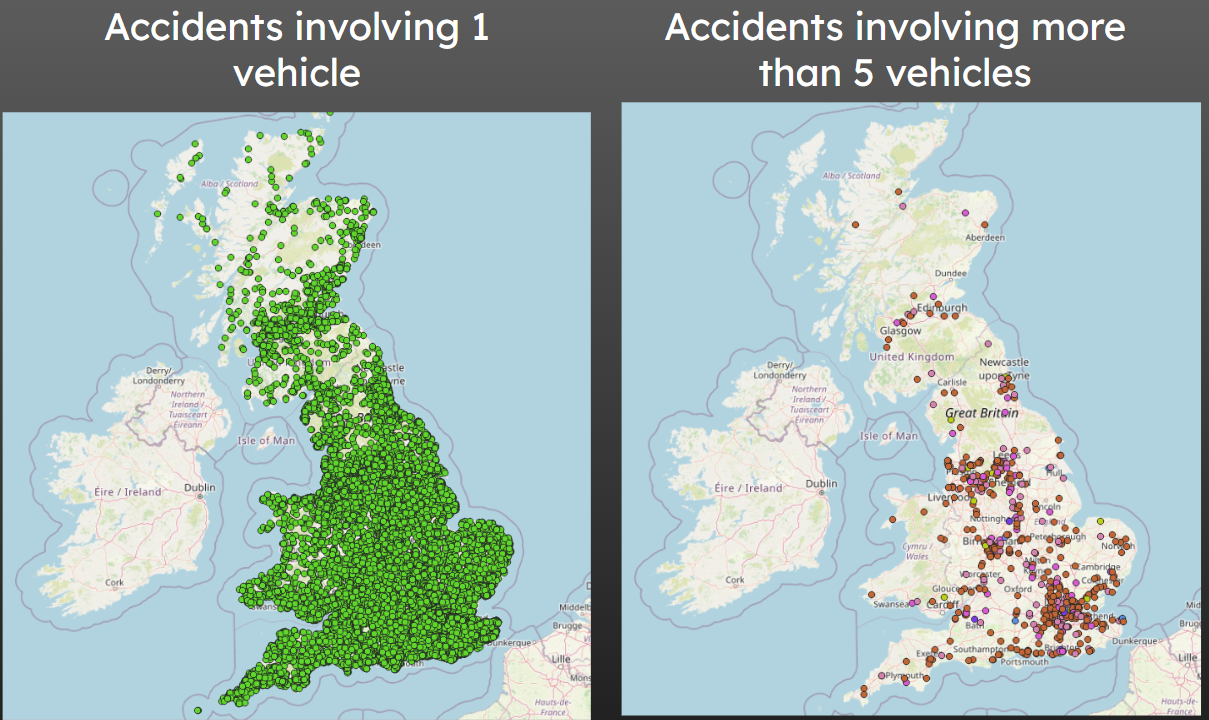
For looking at individual roads, this approach is quite useful, but often there are so many accidents happening of a given type that it’s really hard to draw any conclusions about the country more widely.
This is where colouring regions of the map by some sort of count is quite useful - and this is what we will cover in the next chapter.