11 Creating Choropleths in QGIS - Importing Boundaries
11.1 Reminder - what’s a choropleth?
“A choropleth map is a type of statistical thematic map… [where] color corresponding with an aggregate summary of a geographic characteristic … such as population density or per-capita income.
Choropleth maps provide an easy way to visualize how a variable varies across a geographic area or show the level of variability within a region.
A heat map or isarithmic map is similar but uses regions drawn according to the pattern of the variable, rather than the a priori geographic areas of choropleth maps.”
- https://en.wikipedia.org/wiki/Choropleth_map
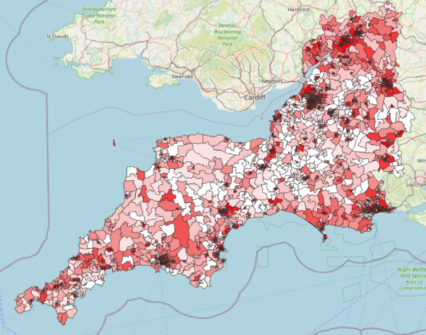
Or, in short, something a bit like this!
And the great news is that we can create these in QGIS.
11.2 Importing a premade geodataset
Sometimes we are lucky enough to have access to a dataset that contains a series of boundaries - so showing where the edges of a series of LSOAs, MSOAs, counties, or some other type of boundary are - as well as giving us some counts relating to those areas.
Unlike our point data, which came in a csv (a type of delimited text file), when we’re working with data relating to areas, we’re going to be using a vector layer.
Vector layers can come in a range of formats: .shp (Shapefile) .geojson (Geo JSON) *.gpkg (Geopackage)
(note: you can also get point data that’s a vector layer)
First, we need to tell QGIS that we want to import a vector layer.
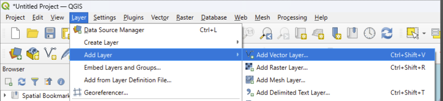
Next, we click on the three small dots next to ‘source’ in the window that pops up to get our file picker.
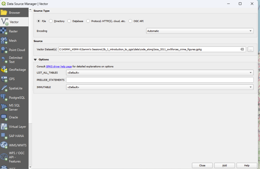
Notice there are no geometry settings here as the CRS is set within the file! So we can just click ‘Add’
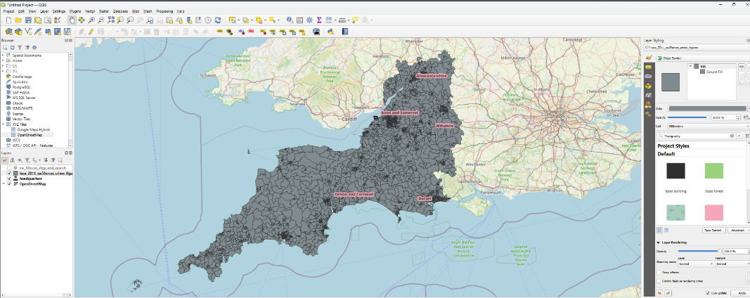
You will now see a number of area boundaries, but at the moment, they are all the same colour - which isn’t much use!
11.3 Adding colour to our choropleths
Previously we were working with data that had a certain number of categories per value.
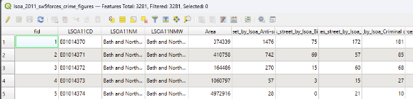
However, if we take a look at the attribute table for this layer, we can see we have numeric values - so instead we want a graduated symbology.
This means values will be grouped together rather than having a separate category per value.
This is just a quick overview of the dataset in this section, opened up within QGIS. Notice that there is a row per LSOA, and some relevant counts for that LSOA stored in the later columns.
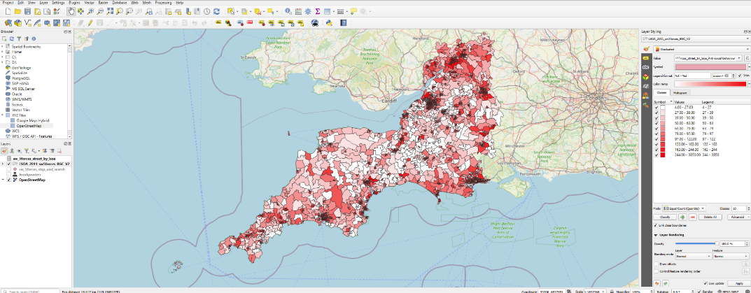
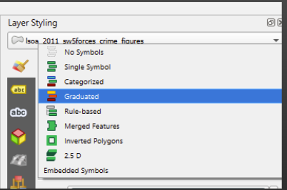
Now we need to head to our layer styling panel. Where it says ‘no symbol’, click in the box and choose ‘graduated’.
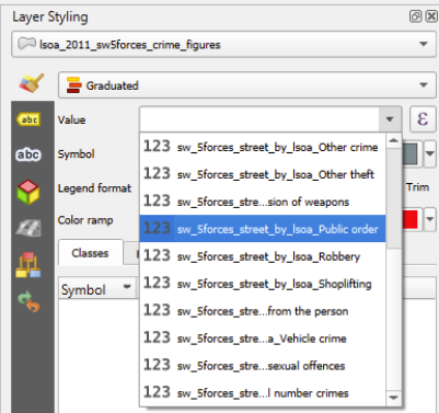
Like before, we need to choose the value we want to colour our areas by.
We’ve got quite a lot to choose from in this dataset.
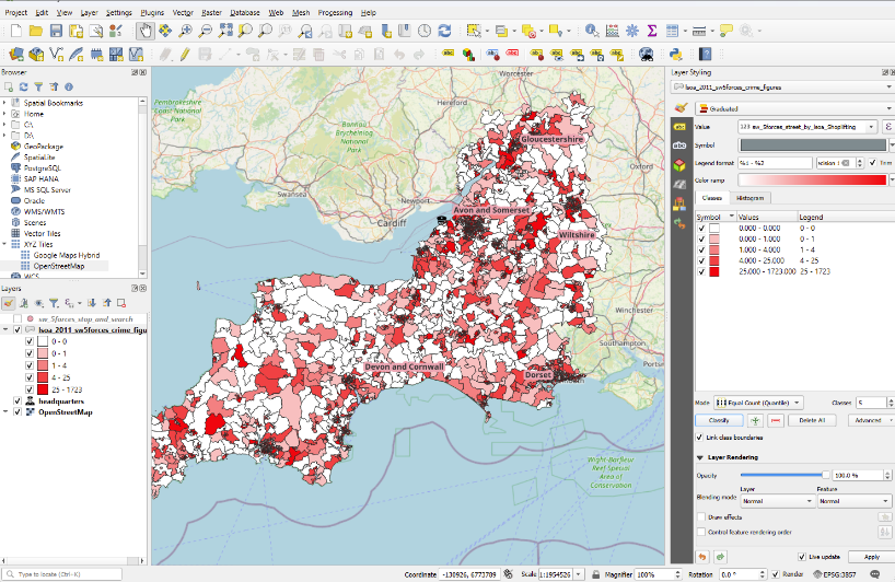
Let’s start by looking at Shoplifting.
To do this, we need to click on the small arrow at the far right-hand side of the ‘values’ box.
Once we’ve selected this, click the ‘classify’ button (if it does not automatically populate the white box with a series of colours and category boundaries).
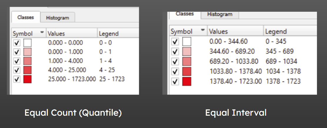
We now have our areas coloured by the number of shoplifting incidents. What do you notice about the categories it has set up for us?
11.4 Adjusting category boundaries and the number of categories in QGIS
11.4.1 Number of categories
First, let’s experiment with the number of categories and see if that helps.
We can change this using the arrows next to the ‘classes’ box, or by typing in the number of classes we would like.
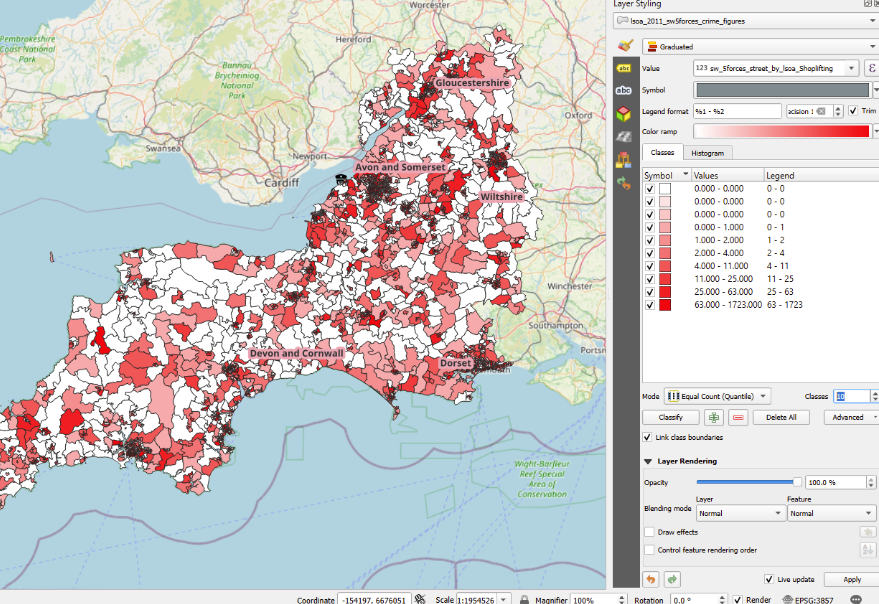
This can produce some odd behaviour when a lot of our groups have a very low number of values in!
We seem to have multiple categories for ‘0’, each with a slightly different colour. That’s not ideal behaviour - though depending on your dataset, this might not occur, and the default categorisation method may work fine, in which case you can just play around with the number of classes.
11.4.2 Categorisation type
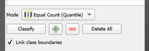
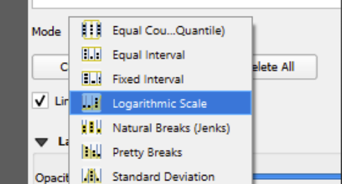
Let’s now try changing the classification mode.
This adjusts the algorithm used by QGIS to work out the size of each category and where the boundary will be.
Click in the ‘mode’ box.
You can see there are several options to choose from.
Let’s try ‘equal interval’
This looks very different - is this a good option?
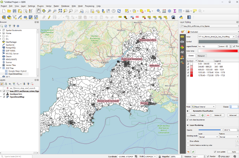
Here, while our categories now are of consistent width (i.e. the number of values they encompass is the same), due to the way the values in this dataset are distributed - with a lot of low values and only a handful of higher ones - the map is quite hard to interpret again.
So a small change to the mode led to a large change in our legend!
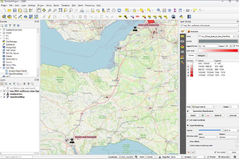
11.5 Hiding categories
Like with our categorised point data, we can untick layers in the layer styling panel to just show certain categories.
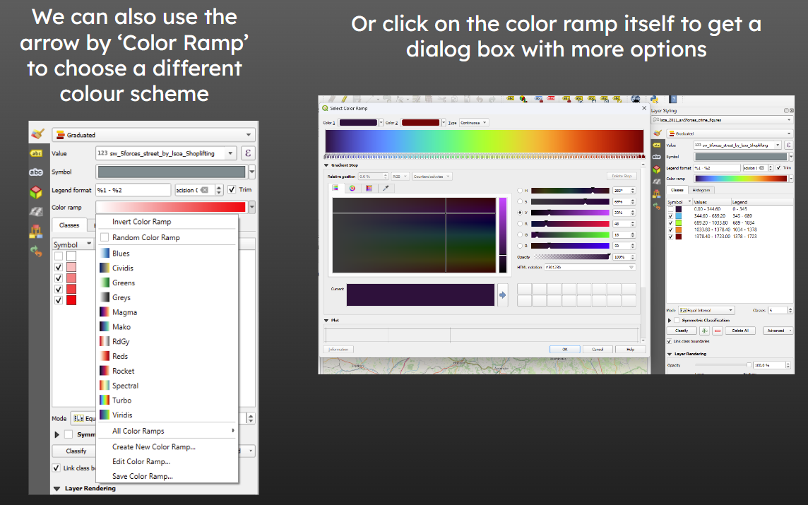
11.6 Changing the Colourscheme
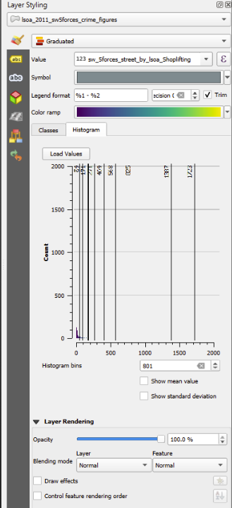
11.7 Viewing the Distribution
If you go to ‘histogram’ and click ‘load values’, you will see the distribution of the values in the column you’re visualising, along with vertical lines showing the boundary of each category.
This can be really helpful for understanding the distribution of your data…
… but sometimes, like this, it’s really hard to see!